2016
LifeShield
UX/UI
Javascript
Coffeescript
Framer
Illustrator
Photoshop
When the CEO and founder of LifeShield, Louis Stilp, saw the work my team and I had done during one of DLab’s open houses, he gave us a call.
LifeShield was acquired by DIRECTV to compete in the home security space, and reach some parity with other broadcast providers. As LifeShield was updating their system and services, Mr. Stilp came to us to take a hard look at their existing app, and update its design and capabilities.
Our timeframe was limited. we had 8 weeks to bring Lou something he could work with, and we had to add home automation features to the app.
Our approach was to immersive ourselves in Lifeshield — to examine the company’s existing and previous UX and UI to understand what current customer expectations were, and to try to create an intuitive and yet powerful interface to add a whole set of new features, without taking anything valuable away.
We begun by taking a trip to Pennsylvania, to LifeShield headquarters, where my team and I toured the company, met with personnel in every department, and interviewed a cross section of the employees. We met with developers, customer service, operations, fulfillment, management and more. We learned about every device in the system, and a deep dive in the current app.
We stayed in town for several days, sketching ideas and using our access to the company to ask questions and test some basic concepts. This time was invaluable, and through the organic conversations it allowed, we learned what made LifeShield’s product special, what the LifeShield customer liked and disliked about the product, and what level of change the company was willing to commit to. We found them to be excited and open to new ideas — a great way to start.
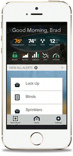
Our conversations led us to a few priorities for LifeShield: live video, remote control, and a live local crime map. We then focused on usability — quick access to information and control of the system in a minimum of clicks. Our goal was to access anything in 2 clicks or less.
Our first prototypes were designed based on swipes to access the major features of the app: down for video, up for the main menu, leaving left and right to swap from a control to an alert view. Testing showed us that while the basic idea was working, there was a long way to go to find the sweet spot.
Later iterations simplified this idea with an onscreen dashboard, a peek to view camera shade and button UI for swapping from commands to alerts. We simplified the menu, locked it to the bottom, and added a modal window for sub menu commands. Our commands list acted as a button to launch, and swiping revealed buttons to edit or delete commands.
We also had to manage adding significant complexity in adding a rule-building system for true home automation. The idea was to make a best in class system that could set up simple commands with ease, but with the power to create deep and complex commands for power users. We took inspiration from MIT’s Scratch project, and came up with a system that could build simple commands into rich macros without ever needing to leave the app. A community based system could add depth for those not interested in building their own commands, and act as a guide to those who wanted to dig deeper. We explored a few different methods of building those rules, including sentences, a method that we thought had a lot of potential, especially if virtual assistants could be added to the mix.
The final result looked simple, but hid a tremendous amount of power. Our demos showed the process of quickly building complex rules to solve basic homeowner problems like controlling sprinklers on a schedule that accounted for weather conditions, or supervising a home while away during an intrusion. It also showed the ease of normal day-to-day use, a customer focused approach that gave LifeShield an exciting direction for future revisions of their app.